“Global Warming: A theory with this many holes in it would be have been thrown out long ago, if not for the fact that it conveniently serves the political function of indicting fossil fuels as a planet-destroying evil and allowing radical environmentalists to put a modern, scientific face on their primitivist crusade to shut down industrial civilization. But can’t we all just stop calling this “science” now?”
by Robert Tracinski
Many years ago, I remember thinking that it would take many years to refute the panicked claims about global warming. Unlike most political movements, which content themselves with making promises about, say, what the unemployment rate will be in two years if we pass a giant stimulus bill—claims that are proven wrong (and how!) relatively quickly—the environmentalists had successfully managed to put their claims so far off into the future that it would take decades to test them against reality.
But guess what? The decades are finally here.
At Forbes, Harry Binswanger dates the beginning of the campaign to 1979 and puts it in an amusing perspective.
“Remember 1979? That was the year of ‘We Are Family’ by Sister Sledge, of ‘The Dukes of Hazard’ on TV, and of Kramer vs. Kramer on the silver screen. It was the year the Shah was forced out of Iran. It was before the web, before the personal computer, before the cell phone, before voicemail and answering machines. But not before the global warming campaign.
“In January of 1979, a New York Times article was headlined: ‘Experts Tell How Antarctic Ice Could Cause Widespread Floods.’…
“So where’s the warming? Where are the gondolas pulling up to the Capitol? Where are the encroaching seas in Florida? Or anywhere? Where is the climate change which, for 33 years, has been just around the corner?”
He concludes that “I’ve grown old waiting for the promised global warming.” Literally: “I was 35 when predictions of a looming ice age were supplanted by warmmongering. Now I’m 68, and there’s still no sign of warmer weather.”
He puts the issue in terms of common-sense observation. But it can also be measured in terms of hard data. We’re reaching the point where the predictions have been around long enough to allow for significant comparison against the actual data, and we are now able to say definitively that the predictions were horribly exaggerated.
Steven Hayward points to signs that even advocates of the global warming hysteria are starting to backtrack.
“The new issue of The Economist has a long feature on the declining confidence in the high estimates of climate sensitivity. That this appears in The Economist is significant, because this august British news organ has been fully on board with climate alarmism for years now. A Washington-based Economist correspondent admitted to me privately several years ago that the senior editors in London had mandated consistent and regular alarmist climate coverage in its pages.
“The problem for the climateers is increasingly dire. As The Economist shows in its first chart (Figure 1), the recent temperature record is now falling distinctly to the very low end of its predicted range and may soon fall out of it, which means the models are wrong, or, at the very least, that there’s something going on that supposedly ‘settled’ science hasn’t been able to settle.”
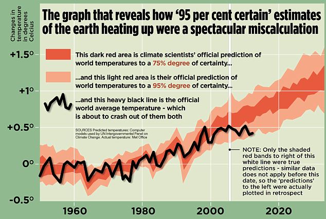
This graph (Figure 1), makes it clear that the actual predictions in the graph date only to about 2006—and they are already being proven wrong.
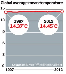
You know, you can really manipulate a graph to spin the data, for example, by manipulating the scale to “zoom in” and make something look bigger or “zoom out” to make it look smaller. We’re used to seeing the zoomed-in version of global temperature measurements, so it’s nice to see this zoomed-out version:
Rather than narrowing in to measure minor variations from the long-term average, which makes annual variations of a few tenths of a degree look enormous, this one zooms out to show us the data in terms of absolute temperature measurements, in which the annual variations over the past 15 years look as insignificant as they really are.
So basically, all that the global warming advocates really have, as the evidentiary basis for their theory, is that global temperatures were a little higher than usual in the late 1990s. That’s it. Which proves nothing. The climate varies, just as weather varies, and as far as we can tell, this is all well within the normal range.
That has been one of my complaints about the global warming scare since the very beginning. We only have systematic global temperature measurements going back about 150 years, which on the relevant timescale—a geological time-scale—is a blink of an eye. Moreover, the measurement methods for these global temperatures have been not been entirely consistent, making them susceptible to changes due to everything from a different paint used on the outside of the weather station to the “urban heat island” effect that happens when a weather station in the middle of a field is surrounded over the years by parking lots. And somehow, among all the billions spent on global warming research, not much money seems to have made its way to the enormous international effort that would be required to ensure the accurate and consistent measurement of global temperatures.
So we have not been able to establish what ought to be the starting point for any theory about global temperatures: a baseline for what is a normal global temperature and what is a natural variation in temperature.
In an effort to fill in this gap—without ever admitting what a fundamental problem it is—the alarmists have made several attempts to patch together a much longer record of global temperatures, going back thousands of years. Michael Mann set the tone for this with his infamous “hockey stick” graph purporting to show temperatures going back 1,000 years, with recent temperatures spiking up ominously like the blade on a hockey stick.
But Mann’s hockey stick came under withering fire for its dodgy statistical methods and selective use of data and has since been pretty much abandoned. But that hasn’t kept the warmists from trying again, this time with a new graph, named after lead study author Shaun Marcott, purporting to show global temperatures over the past 11,300 years, this time with a new, even bigger “blade” to the hockey stick showing the supposed upward thrust of temperatures in the past 100 years.
Except that the whole thing is dissolving in another fiasco.
The problem with using historical reconstructions of past temperatures is precisely the fact that we don’t have direct measurements going back more than 150 years. So scientists have to look at “proxies”—other things that we can measure that tend to vary with temperature, such as the sizes of tree rings in very old, slow-growing trees, which reflect the annual growth rate of the tree from year to year. Notice that I said these measurements tend to vary with temperature. But they are also affected by a lot of other things, from rainfall to sheep grazing on the bark.
So these proxies are not very accurate, and the usual way of compensating for this is to “smooth” out the data to show changes only on very long time scales, where the year-to-year noise caused by other factors is presumably canceled out. But in the Marcott study, the data was smoothed out over such a long term that it cannot actually say anything about changes over the past 100 years.
Quasi-skeptic Roger Pielke, Jr. reports on what happened when the paper’s authors were pressed on this point.
“In a belatedly-posted FAQ to the paper, which appeared on Real Climate earlier today, Marcott et al. make this startling admission:
“‘Q: What do paleotemperature reconstructions show about the temperature of the last 100 years?
“‘A: Our global paleotemperature reconstruction includes a so-called “uptick” in temperatures during the 20th century. However, in the paper we make the point that this particular feature is of shorter duration than the inherent smoothing in our statistical averaging procedure, and that it is based on only a few available paleo-reconstructions of the type we used. Thus, the 20th century portion of our paleotemperature stack is not statistically robust, cannot be considered representative of global temperature changes, and therefore is not the basis of any of our conclusions.’
“Got that?
“In case you missed it, I repeat:…’the 20th century portion of our paleotemperature stack is not statistically robust, cannot be considered representative of global temperature changes….’
“What that means is that this paper actually has nothing to do with a ‘hockey stick’ as it does not have the ability to reproduce 20th century temperatures in a manner that is ‘statistically robust.’ The new ‘hockey stick’ is no such thing, as Marcott et al. has no blade….
“So what the paper actually shows is the following, after I have removed from the graph the 20th century period that is ‘not statistically robust.'”
Pielke’s amended graph shows a long, steady decline in average global temperatures over the past few thousand years, and…that’s it. That’s all it shows.
But Pielke notes that the 20th-century data, the dramatic blade of the hockey stick, was the centerpiece of the official press releases put out by the study’s sponsors, and of the media’s coverage. And the study’s authors chose to put that data on a graph and publish it. This, by the way, is standard operating procedure for global warming alarmists: publish a paper which is cautious and circumspect about the facts—then pair it with a sensational press release making exaggerated claims and an eye-catching, jerry-rigged graph to give the journalists a juicy picture to publish.
Pielke is very circumspect about applying the term “scientific misconduct,” which is itself a circumspect way of saying, “fraud.” But he needn’t be. When I saw this news item, I was explaining it to my wife, and she said, “So they just made the numbers up.” Well, no, I tried to explain, they were using real numbers, it’s just that they weren’t significant under the relevant statistical methodology and—then she cut me off and repeated: “So they just made the numbers up.” I didn’t have an answer to that. My wife has a certain impatience for the tap-dancing abstractions of ivory tower intellectuals, and it gives her the gift of being able to cut through their polite obfuscations and get to the bottom line. In science, if your numbers aren’t validated by a proper method, if you can’t say for sure whether they are real and meaningful, there is only one thing to do: throw them out. If you have invalid numbers and you use them any way, there is no moral or epistemological difference between that and just making them up out of thin air.
So here’s the state of play of climate science a third of a century into the global warming hysteria. They don’t have a reliable baseline of global temperature measurements that would allow them to say what is normal and natural and what isn’t. Their projections about future warming are demonstrably failing to predict the actual data. And now they have been caught, yet again, fudging the numbers and manipulating the graphs to show a rapid 20th-century warming that they want to be true but which they can’t back up with actual evidence.
A theory with this many holes in it would be have been thrown out long ago, if not for the fact that it conveniently serves the political function of indicting fossil fuels as a planet-destroying evil and allowing radical environmentalists to put a modern, scientific face on their primitivist crusade to shut down industrial civilization.
But can’t we all just stop calling this “science” now?
. . . . . . . . . .
Robert Tracinski is editor of The Tracinski Letter and a contributor to RealClearMarkets.